Mobile-Friendly Website Design in Michigan
More than half of your customers are searching for your services on their phones. If your website does not look great and load fast on mobile, you are losing business every day. We build mobile-first websites that capture every visitor, on every device.
Why Michigan businesses choose Kopplin Co.
Here is what you get when you work with us for mobile-friendly website design.
Mobile-first design approach
We design for smartphones first, then scale up to tablets and desktops. This ensures your site delivers the best possible experience where most of your customers are actually browsing.
Lightning-fast mobile load times
Slow sites lose customers. We optimize every image, script, and asset so your site loads in under two seconds on mobile networks, even on slower connections.
Touch-friendly navigation and buttons
Menus, buttons, and forms are all sized and spaced for easy tapping on any screen. No pinching, zooming, or frustration for your customers on the go.
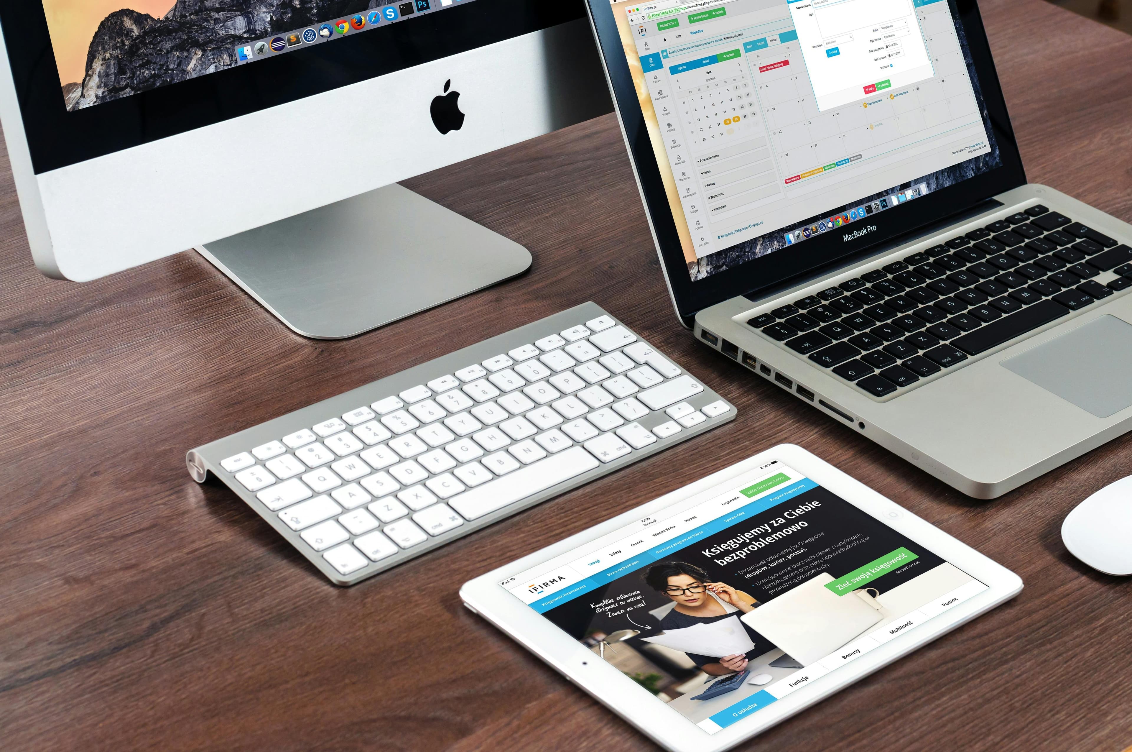
Responsive across every screen size
Your site adapts seamlessly to any device, whether it is a phone, tablet, laptop, or large desktop monitor. Every visitor gets a polished experience regardless of how they find you.
Better Google rankings
Google uses mobile-first indexing, meaning your mobile site is what determines your search rankings. A properly optimized mobile site helps customers find you before your competitors.
Higher conversion rates on mobile
A mobile-optimized site removes friction from the customer journey. Easy-to-tap buttons, fast forms, and click-to-call functionality turn mobile visitors into real leads.
What is included in your mobile-friendly website design
Everything you need to get results, handled for you.
Responsive Layout Design
Flexible layouts that adapt seamlessly to any screen width, from smartphones to large desktop monitors.
Mobile Speed Optimization
Image compression, code minification, and asset optimization for fast load times on mobile networks.
Touch-Optimized Navigation
Mobile menus, buttons, and interactive elements sized and spaced for easy thumb navigation.
Click-to-Call Integration
One-tap phone call buttons that make it effortless for mobile visitors to contact you instantly.
Mobile Form Optimization
Contact forms designed for mobile input with proper keyboard types, auto-fill, and minimal required fields.
Cross-Device Testing
Thorough testing across iPhones, Android devices, tablets, and desktop browsers to ensure consistent performance.
Mobile-Friendly Website Design across all of Michigan
Based in Jackson, Michigan, we work with local service businesses across the state. We also offer all website design services.
Ready to get started with mobile-friendly website design?
Book a free consultation and we will show you how a mobile-optimized website can capture more leads and grow your business.
Only 4 spots per month · 30-day delivery · More leads guaranteed or $1,000 back