Published on May 1, 2026
TL;DR
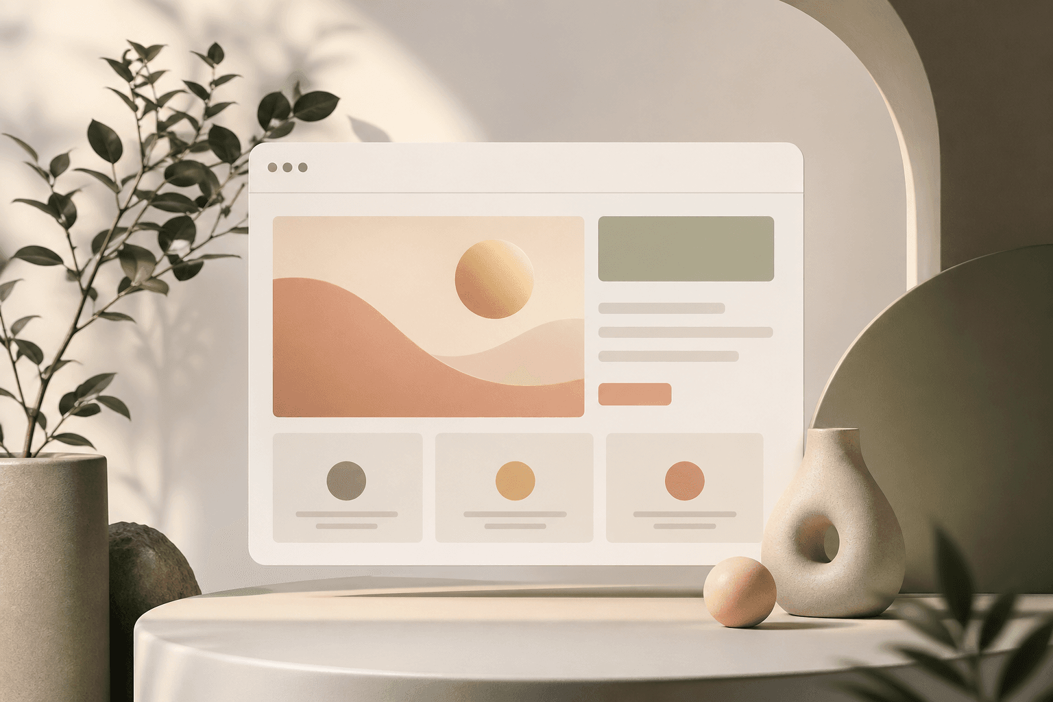
- Whitespace and restraint: Expensive sites give content room to breathe. Cheap sites cram everything above the fold.
- Typography hierarchy: One or two well chosen fonts, used at very different sizes, beats five competing fonts every time.
- Real imagery over stock: Generic stock photos instantly read as cheap.
- Consistent spacing and alignment: Premium sites have a rhythm, cheap sites have things floating in random places.
- Smooth performance and subtle motion: Fast load times and quiet animations make a site feel high end.
- A tight color palette: Two or three colors used with intent looks more expensive than a rainbow.
Introduction
A lot of business owners ask me what makes their site feel cheaper than a competitor's, even when they paid real money for it. The answer is almost never the budget for graphics or stock images. The look of an expensive website comes from a handful of design choices that take taste and discipline more than they take money. Once you can see them, you cannot unsee them.
Below are the things I look at first when I want to figure out why a site reads as premium or budget at a glance.
Whitespace and restraint
The single biggest difference between an expensive looking site and a cheap one is whitespace. Premium sites are confident enough to leave large empty areas around the headline, around buttons, and between sections. Cheap sites try to fill every pixel because the owner is worried the visitor will not see something important.
If your homepage feels crowded, the fix is rarely to add more, it is to remove. Strip the hero section down to one headline, one supporting line, and one button. Give it room. The site will feel more expensive without changing a single color or font.
Typography hierarchy
Fonts are where most DIY sites give themselves away. The cheap pattern is three or four fonts fighting each other, all roughly the same size, with bold and italics sprinkled in for emphasis. The expensive pattern is one or two fonts, used at very different sizes, so the eye knows exactly where to land first.
A premium site usually has a large display headline, a clearly smaller subhead, and body text that is comfortable to read on a phone. The contrast in size does the work, not extra colors or weights. If you are picking fonts, default to one good sans serif for everything and only add a second font if there is a real reason.
Real imagery over stock
Generic stock photography is the fastest way to make a site look cheap. The smiling headset call center, four people pointing at a laptop, the handshake over a desk, you have seen them all and so has every customer. The brain registers them as filler and skips right past.
Real photos of your team, your shop, your trucks, or your finished work outperform stock every time, even when the photos are not perfect. If a photoshoot is not in the cards, lean on simple branded illustrations or clean product shots on a plain background instead of leaning on stock.
Consistent spacing and alignment
Premium sites have a rhythm. Section padding is the same from the top of the page to the bottom. Buttons are the same height. Cards line up on a grid. Headlines start at the same left edge as the paragraph below them.
Cheap sites have one section with 40 pixels of padding and the next with 120, buttons of three different sizes, and text that is centered in one place and left aligned in another for no reason. Most visitors cannot articulate what is wrong, they just feel that something is off. Pick a spacing scale and use it everywhere.
Smooth performance and subtle motion
A site that loads in under two seconds and responds instantly to clicks feels more expensive than one with fancy graphics that lag. Performance is part of the design, not a separate engineering concern.
Motion is the same story. Subtle fades, a button that gently changes on hover, a small underline that draws in under a link, those touches signal care. Heavy animations, sliders that auto scroll, and pop ups that fly in from every direction signal the opposite. If you are going to use motion, keep it quiet and consistent.
A tight color palette
Most expensive looking sites use two or three colors total. A neutral background, a single accent color for buttons and links, and maybe one supporting tone. That is it. Cheap sites pull in a new color every time they want to highlight something, and the page ends up looking like a flyer.
A tight palette also makes the accent color do real work. When the only red on the page is on the call to action button, that button gets noticed. When everything is colored, nothing is.
Small details that quietly add up
A few smaller things that I see on almost every premium site and almost no DIY site:
- Properly styled link underlines instead of bright blue defaults.
- Buttons with the same corner radius across the entire site.
- Form fields that are large enough to tap on a phone without zooming.
- Images cropped to the same aspect ratio inside a grid.
- A favicon that is not the platform default.
None of these cost extra, they just take someone paying attention.
Conclusion
An expensive looking website is mostly the result of restraint, hierarchy, and consistency, not a bigger budget. Cut things until the page feels calm, pick one or two fonts and use them at very different sizes, swap stock photos for anything real, and lock in a tight color palette and spacing scale. Do those five things and your site will outperform most competitors visually before you change a word of copy.
If you want a second set of eyes on your current site, book a call and we will walk through what is making it look cheaper than it should and what to fix first.

Written by